Hi everyone! Today I want to share I layout I posted over on the Scraptastic Club Blog using the March Lost In My Mind kit and add on.
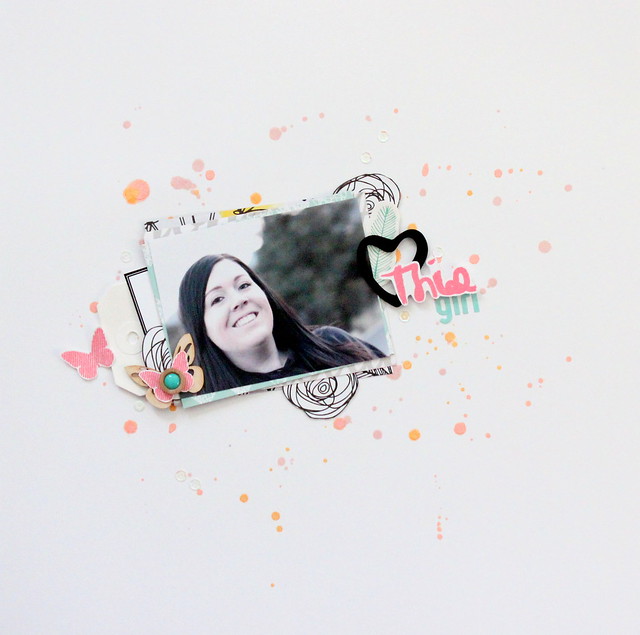
There was a discussion over in the forum talking about using a white background. I know some people are over it or think it's boring but I'm still in love it with. I tend to get stuck when I use a solid bold color as my starting point and if I use a patterned background I find myself using less embellishments on the page. I like to keep the focus on the photo while adding lots of tiny details.
Here's my page with my white background.
I used three colors of Heidi Swapp mists to add some color to the page. I layered some pretty papers and embellishments, stamped a couple things and I was happy.
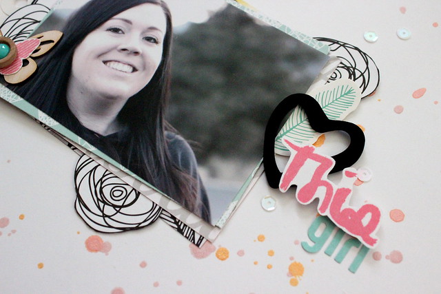
I used the Lost In My Mind stamp set and stamped "this" with some Heidi Swapp ink and cut out a couple flowers from a patterned paper to use as embellishments.
I made a little butterfly embellishment using a wood veneer piece from the kit, a stamp from my stash and a cute wood/enamel dot from the kit.
So what are your thoughts on a white background? I would love to hear. Are you growing tired of it? For me it's something that is timeless and I'm sure I will continue to use a white page with the occasional patterned background here and there.
Thanks so much for stopping by!


No comments:
Post a Comment